

What Oak & Ivory does
The template defines 12 tools — 8 Interactive Tools and 4 Data Tools. This page walks through two of them:
Together they support flows like:

product_search returns JSON, product_detail returns interactive UI.
Get the sample
Two ways:- In Metabind Studio onboarding. When you sign up, onboarding offers the MCP Starter Project (the Oak & Ivory retail demo). Metabind Studio provisions the components, Types, and sample data.
- From a template. In an existing organization, click New Project → Create MCP Server, then choose MCP Starter Project.
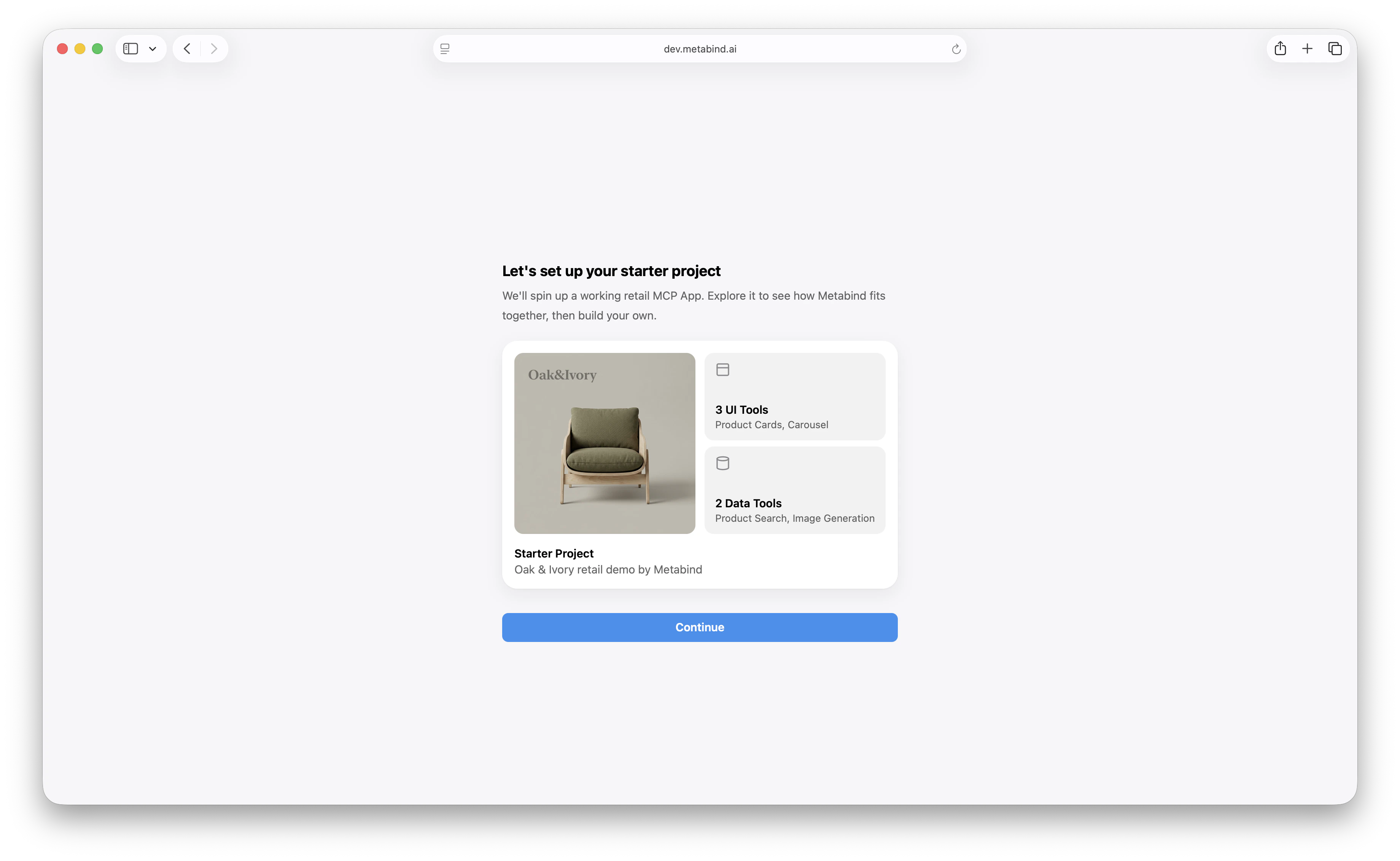
What’s in the project
The sample API runs on Metabind’s infrastructure — no external dependencies to set up. For a production deployment, theproduct_search handler would point at your real catalog.
How product_search works
The Data Tool’s handler queries the catalog through the Metabind Content API and maps each result to a product:
env.secrets, and likely transform the response shape. The patterns are what generalize: schema validation, V8 sandbox, output validation, sandbox limits.
See Sandboxed execution for the runtime model.
How product_detail works
The Interactive Tool is bound to the ProductDetail component. Its input schema mirrors the component’s properties:
product_detail with a product, the platform:
- Validates the input against the schema.
- Compiles
ProductDetail’s BindJS layout against the input. - Returns an MCP UI resource for the host to render.
product_lookup tool to load the product’s title, price, description, and image.
Inside your own app via the Assistant SDK, the card renders as SwiftUI on iOS and Jetpack Compose on Android. Web hosts like Claude and ChatGPT render it as React, via @metabindai/bindjs-react in a sandboxed iframe.
Sub-component reuse
ProductDetail is composed from smaller pieces — BrandBackground and EnvironmentSizeClass. These are normal BindJS components in the project, available as building blocks for other layouts.
The template’s other layouts already reuse them: ProductCarousel combines BrandBackground, EnvironmentSizeClass, and ProductCard. The sub-components carry the styling through.
Component allowlist
The template declares its allowlists on layout slots:ProductGroupings allows ProductSection, and ProductSection allows ProductCarousel. If a new MCP App reused this package and added a LandingHero layout, that layout would declare its own slot allowlists.
See Component allowlists.
Connecting Oak & Ivory to Claude Desktop
Once the sample is in your account:- Open the Server tab in the project sidebar.
- Copy the production URL.
- Add it in Claude Desktop as a custom connector. See Connect to Claude Desktop.
product_search, picks the top result, then calls product_detail to render it. You see an interactive product card inline in the conversation.
Embedding Oak & Ivory in your own app
To embed the same tools in a custom app via the Assistant SDK, see Assistant SDK overview. Point the SDK at the Oak & Ivory project, choose the Metabind Agent proxy or your own Anthropic key, and ship. The sameproduct_search and product_detail calls work, and the rendered cards appear as SwiftUI on iOS, Jetpack Compose on Android, and React on the web.
Customizing Oak & Ivory
Once Oak & Ivory is in your account, it’s a real project — modify it freely:- Replace the sample API. Point
product_searchat your real catalog and add an API key secret. - Restyle the components. Edit
ProductCard, change colors, change layout. - Add new tools. A
cart_add, awishlist_save, arecommendationsData Tool. Each becomes another Type. - Publish. When you’re done, publish the package — it’s now your own MCP App.
Related
Your first MCP App
The end-to-end tutorial that uses Oak & Ivory.
Build an Interactive Tool
The pattern
product_detail follows.Build a Data Tool
The pattern
product_search follows.Connect to Claude Desktop
Try Oak & Ivory’s tools in a real host.